Project Challenges
Images Creation
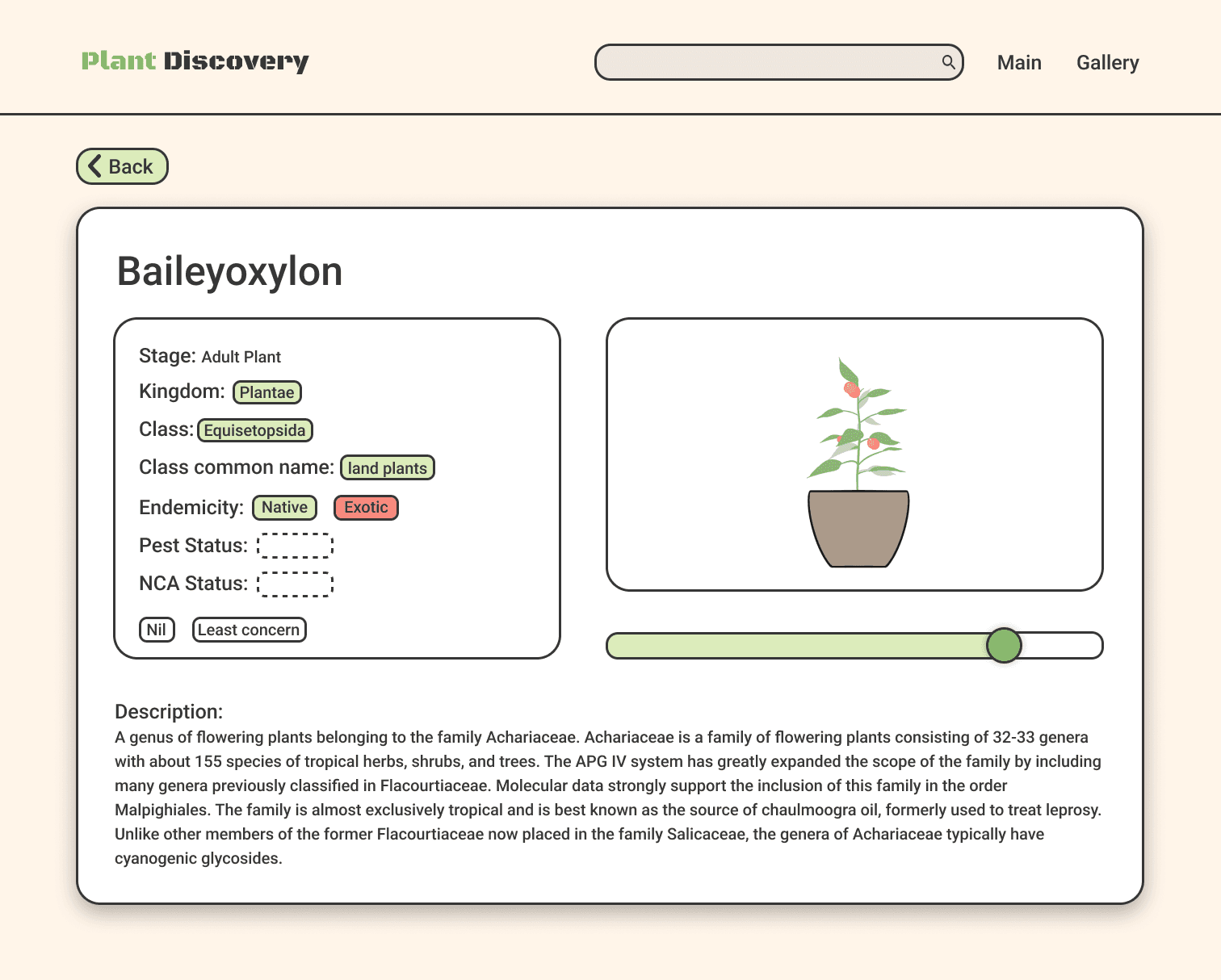
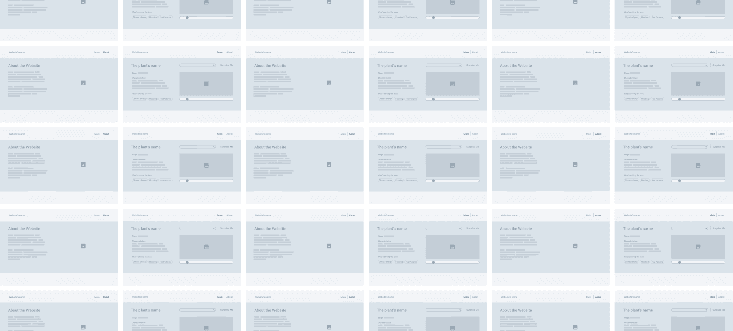
In the initial concept, the project’s main feature was to showcase the lifecycle of plants, which set it apart from existing websites. However, the available databases did not include suitable images to fully realize this idea. As the website focuses on Australia’s endangered plants, online resources contain only limited fragments of information about these unique species. To address this, the team retained the key feature but used illustrations instead to represent each plant.
Missing Data
We discovered that the selected datasets lacked complete information and had limited content during the website development process. Relying solely on these datasets would create significant data gaps. The team reviewed three datasets to resolve this issue, carefully selecting relevant information to build detailed plant profiles. Additionally, we expanded the content by writing more comprehensive descriptions to supplement the gaps in the datasets, forming concise profiles for each plant while integrating the original data.
Insufficient Interaction with Data
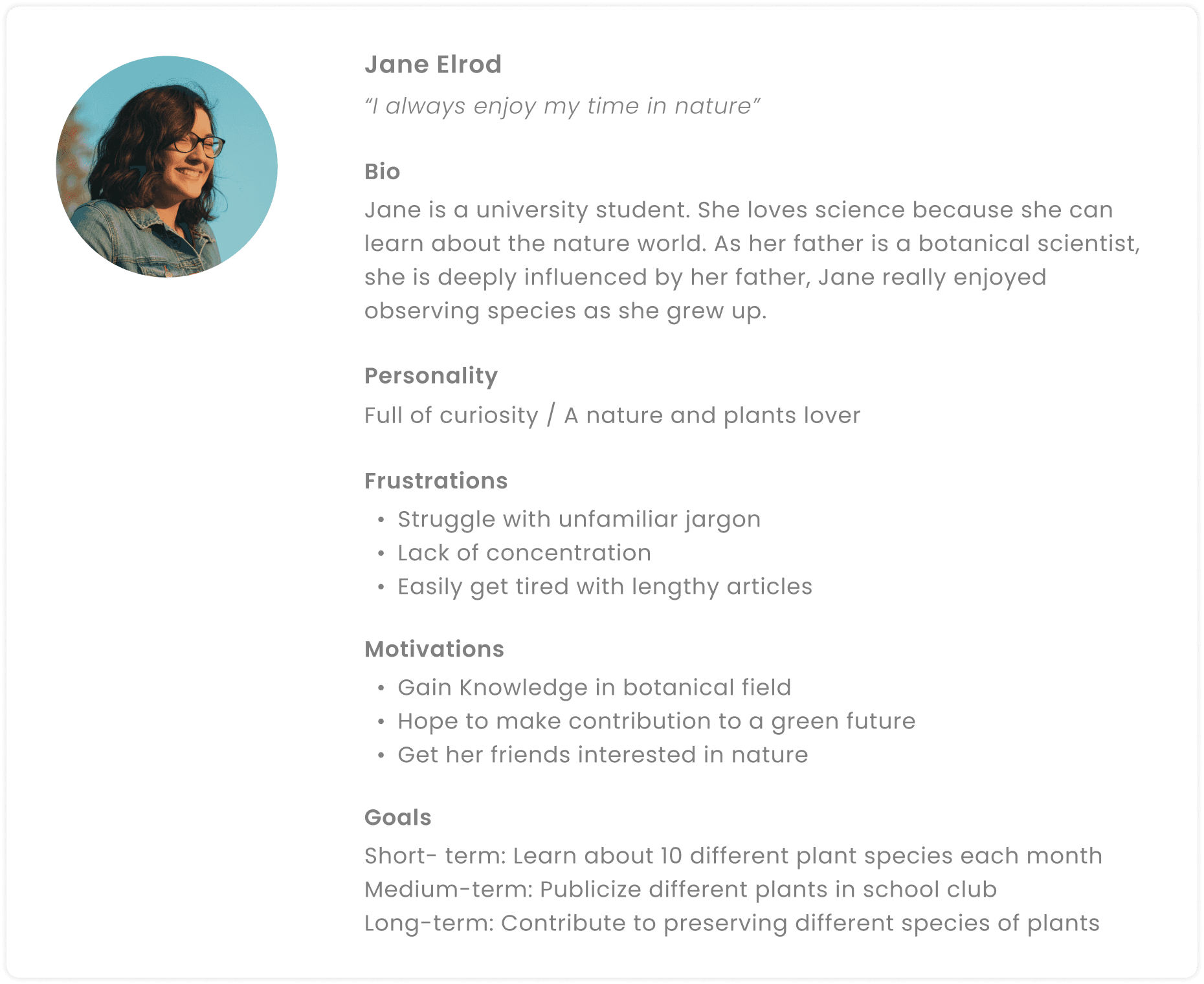
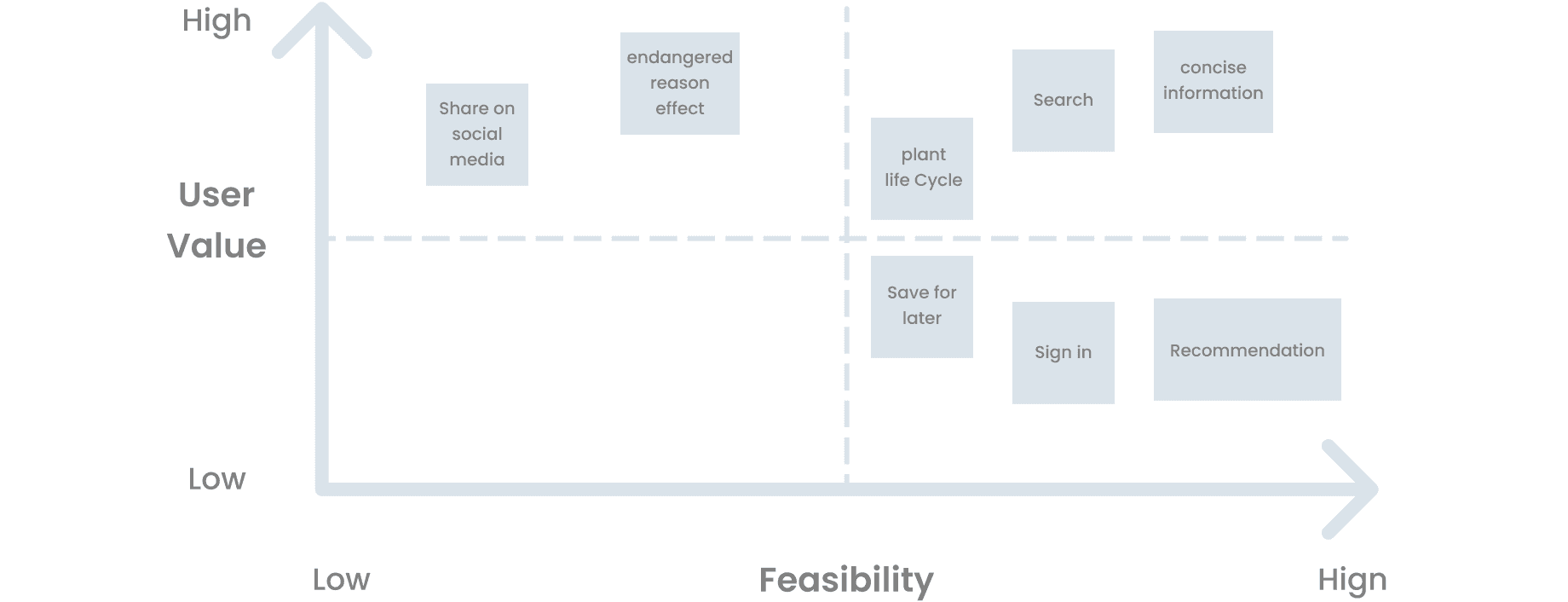
After completing the initial phase of the Minimum Viable Product (MVP) and conducting tests, the team noticed that removing certain features had led to insufficient interactivity. To address this, we interviewed target users and gathered suggestions. Through these interviews, we incorporated the concept of "learning flashcards," enhancing the overall interactive learning experience.
Testing and Iteration
Three Testing Tasks
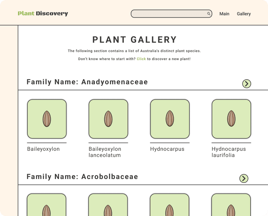
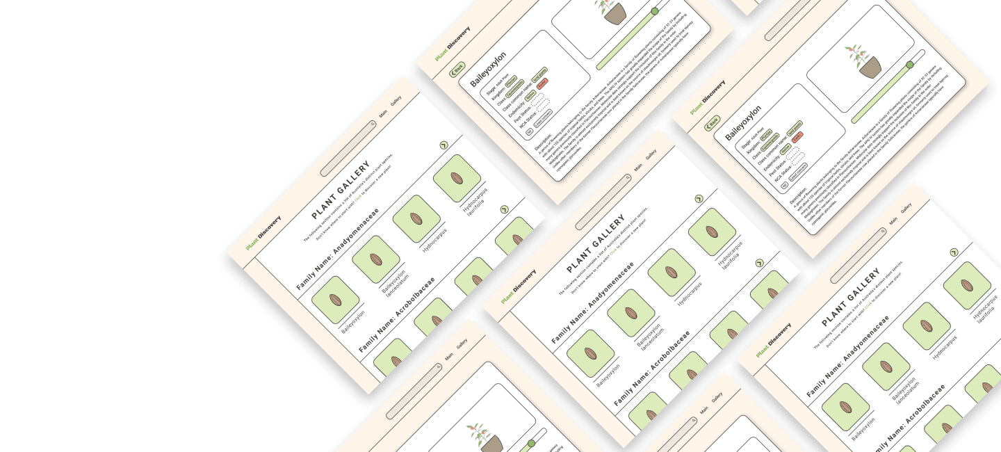
Locating the plant "Goebelobryum grossitextum" on the plant gallery page
Finding the plant "Baileyoxylon" and read its plant description
Observing the growth process of the plant "Baileyoxylon" through interactive features
Add interactive fill-in-the-blank responses
Add audio pronunciation options to assist users with plant names
Visual Design
Color Pallate
Through secondary research, the team analyzed color preferences that align with the project's theme and target audience. Ultimately, I selected three primary colors to build the website's design, ensuring visual consistency throughout.
Project Results
The final testing results demonstrated positive outcomes for the project. 92% of participants easily navigated the website and fully understood the functionality of each feature. The UI design received enthusiastic feedback at the showcase, with most users noting that it significantly enhanced the website’s usability.
In follow-up interviews, users highlighted the drag-and-drop feature as particularly helpful in their learning process, fulfilling the project’s initial goal of improving the user learning experience.
participant A
participant B
Reflection
At the start of the project, I aimed to deepen my knowledge of product design through the development process and create a user-friendly platform. While I believe we achieved commendable results despite time constraints, I realized the challenges of ensuring that every team member clearly understands the project goals and plans.
Despite ongoing communication throughout the project to bridge information gaps, not all members could consistently stay up-to-date, which occasionally hindered progress. However, this challenge provided valuable opportunities to practice balancing teamwork dynamics and addressing project limitations. I believe these experiences will enable smoother collaboration and development in future team settings.
